 |
Microsoft Power BI vs Tableau
March 12, 2025 | Author: Michael Stromann
30★
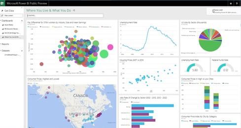
Power BI transforms your company's data into rich visuals for you to collect and organize so you can focus on what matters to you. Stay in the know, spot trends as they happen, and push your business further.
31★
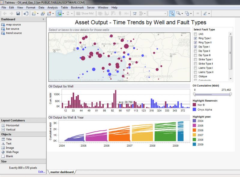
Tableau complements your natural ability to understand data visually. Our breakthrough products let you create rich analyses and share your insights with colleagues in seconds. Connect and visualize your data in minutes. Tableau is 10 to 100x faster than existing solutions. From spreadsheets to databases to Hadoop to cloud services, explore any data with Tableau.

Microsoft Power BI and Tableau are, in essence, two large, sophisticated entities designed to make sense of the world’s ever-growing piles of data. They both allow users to take enormous, incomprehensible spreadsheets and turn them into colorful, slightly less incomprehensible charts. Both let you drag, drop and poke at your numbers until they start telling a story—or at least stop looking so dull. They even dabble in artificial intelligence, trying their best to answer your questions before you’ve even figured out how to ask them properly. In short, they exist to make analysts look like wizards and business executives nod thoughtfully at dashboards they don’t quite understand.
Power BI is Microsoft’s answer to the question, “What if Excel went to the gym and learned how to party?” Launched in 2015, it is deeply embedded in the Microsoft universe, meaning if you’ve ever used Excel, SharePoint or Outlook (and sighed in frustration), you’ll feel right at home. It is also, conveniently, more affordable, which makes it the preferred choice for small businesses, finance departments and anyone who enjoys pressing buttons in a familiar-looking interface. Unlike Tableau, it lives primarily in the cloud, which is great if you like accessing your reports from anywhere and terrifying if you still haven’t figured out where the cloud actually is.
Tableau, on the other hand, has been around since 2003, meaning it had a solid head start before Power BI even got out of bed. Born in the USA and later adopted by Salesforce, it is the go-to choice for people who take their data visuals very, very seriously. It specializes in intricate, mind-bogglingly detailed charts that make analysts beam with pride and casual viewers squint in confusion. It costs more, but that’s because it offers a level of customization and complexity that data scientists adore—mostly because it gives them a legitimate reason to look smug in meetings. Unlike Power BI, it works seamlessly across multiple platforms and can handle a chaotic mix of data sources with the grace of a seasoned diplomat.
See also: Top 10 Business Intelligence software